Latex Bar Plot
I have the data stored on the 2024-10-26_game_count.csv file:
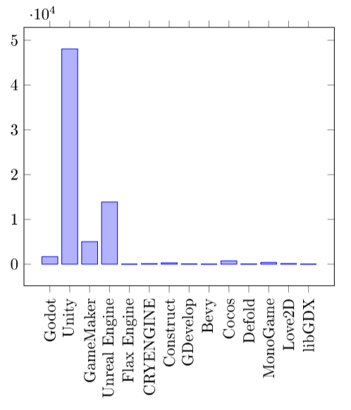
Engine,Steam
Godot,1691
Unity,48066
GameMaker,5032
Unreal Engine,13891
Flax Engine,0
CRYENGINE,126
Construct,302
GDevelop,57
Bevy,0
Cocos,741
Defold,31
MonoGame,387
Love2D,146
libGDX,0
We can make the bar plot using:
\documentclass{article}

\usepackage{pgfplots}
\usepackage{pgfplotstable}

\pgfplotsset{compat=newest}

\begin{document}

\begin{figure}
  \begin{tikzpicture}
      \pgfplotstableread[col sep=comma]{2024-10-26_game_count.csv}\datatable

      \begin{axis}[
      ybar,
      xticklabels from table = {\datatable}{Engine},
      xtick = data,
      xticklabel style={rotate=90},
      ]
      \addplot table[x expr=\coordindex,y=Steam] {\datatable};
    \end{axis}
  \end{tikzpicture}
  \caption{Amount of games made with the engines on Steam}
\end{figure}

\end{document}-
We need the
pgfplotsandpgfplotstablepackages. We must indicate the pgfplots version with\pgfplotsset{compat=newest}. -
With
\pgfplotstablereadwe indicate how to read the file, using commas as separation, and we define the data as \datatable. -
To make the plot a bar plot, we use the
ybaroption of the axis. -
With
xticklabels from table = {\datatable}{Engine}we configure the tick labels to be the same as the first column. -
xtick = datamakes one tick for each data we have. Without this, pgfplots will reduce the number of ticks if there is much data. -
With
xticklabel style={rotate=90}we rotate the tick labels 90 degrees so they aren’t on top of each other. -
Finally, we create the plot with
\addplot table[x expr=\coordindex,y=Steam] {\datatable};. We make the point x correspond to the coordinate index and we select the point y from the second column with header “Steam”.
Here’s the result: